[SK] Portfolio / Selected Work / Employee Benefits Enrollment
PROJECT_002 // 2025–26
Insurance · Benefits Platform

Reimagining Employee
Benefits Enrollment

MY ROLELead UX/UI Designer
INDUSTRYInsur Tech / SaaS
TIMELINE2025–26
TYPEWeb Application
Making Employee Benefits Simple — Platform Overview
My RoleLead UX/UI Designer
Timeline2025 – 26
PlatformWeb · Insur Tech / SaaS
StatusShipped · 2026
01

The Problem

The existing employee benefits enrollment experience was fragmented and difficult to navigate, leading to high drop-offs, increased support queries, and low employee confidence during plan selection. The goal was to simplify decision-making, improve completion rates, and create a scalable experience that balanced user needs with compliance and business constraints.

Additionally, the platform needed to present complex benefit information in a clear, comparable format so employees could easily evaluate available options. The solution also aimed to reduce HR dependency by enabling a guided, self-service enrollment experience.

"A UX exploration into simplifying benefits enrollment — reducing friction, improving clarity, and empowering employees to make informed decisions."
— Project Brief
02

Research Process

03

Key Insights

01
Need Simpler Explanations

Employees frequently ask HR to explain insurance plans — plan language and coverage details are too complex to parse independently, creating a bottleneck at every open enrollment cycle.

💬 Need simpler explanations
02
Opportunity for Self-Service

HR spends significant time answering repetitive questions during open enrollment — a clear signal for guided, self-service tooling that reduces operational burden at scale.

⚙️ Opportunity for self-service
03
Need Clearer Reminders

Employees often miss enrollment deadlines — pointing to a lack of timely, contextual nudges and poor deadline visibility baked into the existing platform experience.

🔔 Need clearer reminders
04

Process

01

Discovery

Stakeholder interviews, HR ticket analysis, and competitive benchmarking to fully scope the enrollment problem before designing a single pixel.

02

Define

AI-assisted affinity mapping to cluster insights into opportunity areas. Journey mapping to align on the ideal enrollment experience across all user types.

03

Design

Wireframes through high-fidelity prototypes. Progressive disclosure to cut cognitive load. Iterative testing with employees across roles and experience levels.

04

Deliver

Annotated specs, component documentation, and close engineering collaboration through launch — followed by post-ship measurement to validate outcomes.

05

User Journey Map

Mapped the end-to-end employee enrollment journey across six stages — Awareness, Exploration, Evaluation, Decision, Enrollment, and Confirmation — identifying friction points and design opportunities at each touchpoint.

USER ACTIONS
THOUGHTS
PAIN POINTS
OPPORTUNITIES
01 Awareness
📧 Receives email about benefits enrollment
What benefits do I need?
⚠️ Too many documents to navigate
✦ Create a simple, consolidated benefits dashboard
02 Exploration
🔍 Browses available benefits
Which plan is best for me?
⚠️ Difficult to compare plans side-by-side
✦ Provide interactive comparison tables
03 Evaluation
📄 Reads through plan details
What does this coverage actually mean?
⚠️ Insurance jargon causes confusion
✦ Add tooltips and plan-language explanations
04 Decision
✓ Selects a plan
Am I choosing the right one?
⚠️ High decision uncertainty and second-guessing
✦ Show AI-recommended plans based on profile
05 Enrollment
👥 Adds dependents and confirms selection
This form is incredibly long.
⚠️ Form fatigue from lengthy, complex inputs
✦ Guided step-by-step flow with progress tracking
06 Confirmation
✓ Receives confirmation of enrollment
Did I miss anything important?
⚠️ Lack of clear enrollment summary
✦ Provide a visual enrollment summary with key details
Fig. 02 — Employee enrollment journey: Awareness → Exploration → Evaluation → Decision → Enrollment → Confirmation
06

User Flow

A 10-step enrollment flow from Employee Login through Plan Selection, Compare Plans, Add Dependents, Review, and Confirm — with decision branches for plan re-comparison and editing before commitment.
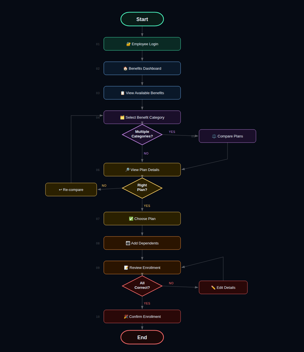
10-step enrollment user flow diagram
Fig. 03 — 10-step flow: Login → Dashboard → Select → Compare → Details → Choose → Dependents → Review → Edit → Confirm
07

Before & After

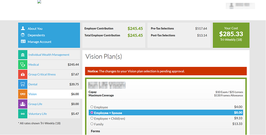
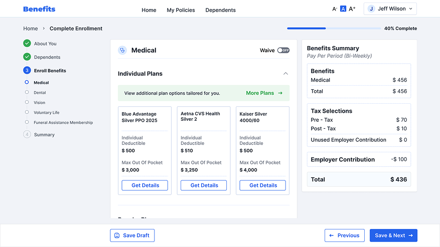
The legacy enrollment experience asked people to make high-stakes decisions inside a dense, multi-coloured screen with the real cost buried in side panels. The redesign replaces it with one clear next step, one running summary, and one calm visual system.
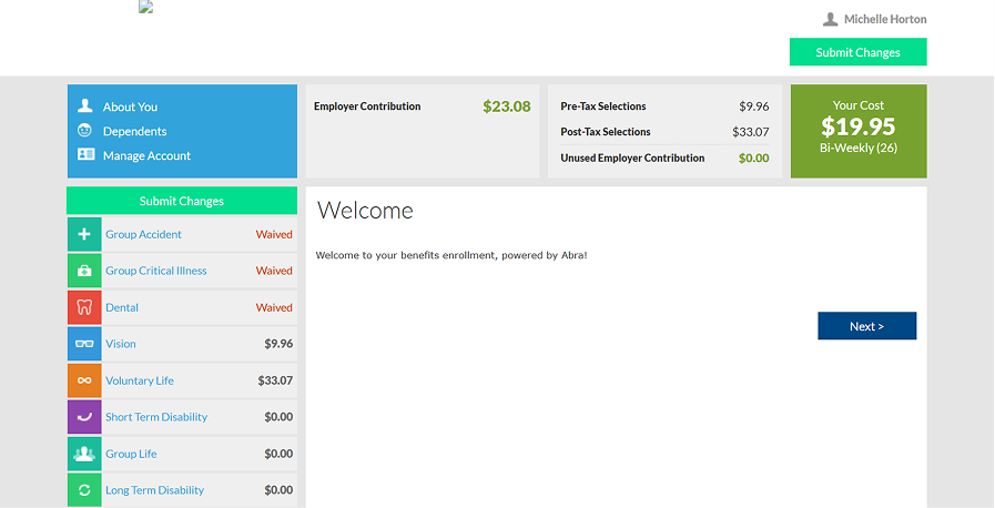
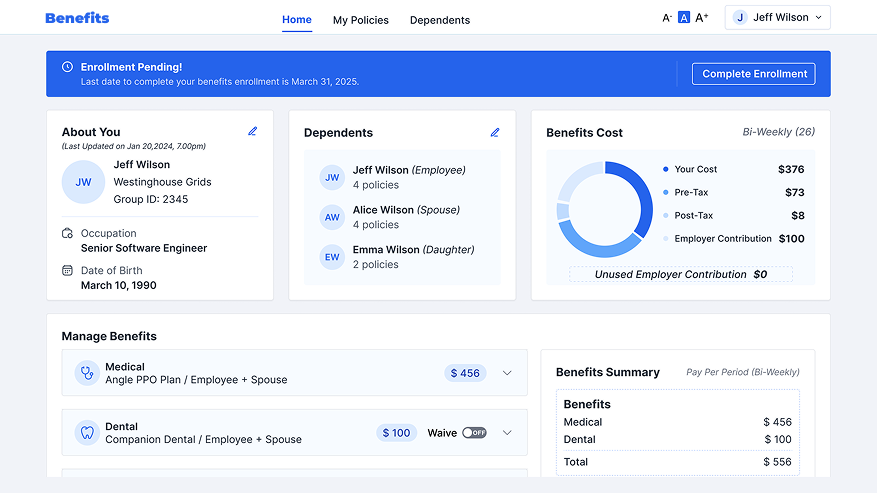
Home & Orientation
Before · Legacy
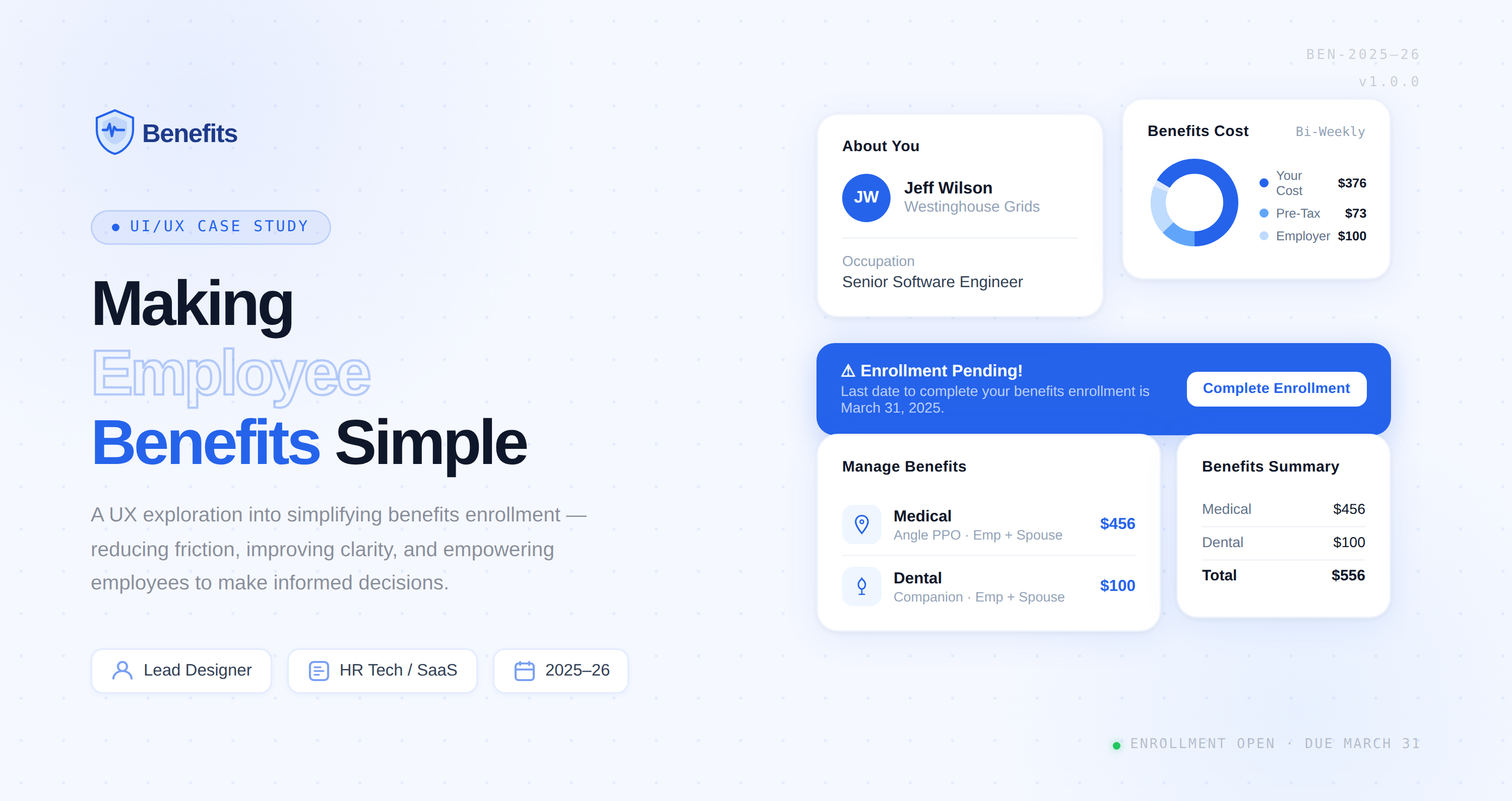
Legacy enrollment home: welcome message, coloured plan list and four cost tiles
  • Empty welcome: a blank page and a single "Next" with no sense of progress or deadline.
  • Cost scattered across four separate tiles, with the plan list repeating amounts again.
  • Two "Submit Changes" buttons compete before anything has been chosen.
After · Redesign
Redesigned benefits home with enrollment banner, profile, dependents and cost donut
  • Status banner states the deadline and gives one action: "Complete Enrollment".
  • Cost at a glance: a single donut splits your cost, tax and employer contribution.
  • Profile and dependents sit up front so people can confirm details before choosing.
Choosing a Plan
Before · Legacy
Legacy plan selection: radio list of coverage tiers with a red pending notice
  • Eight colours across the plan rail, plus a red notice, a blue selection and a green frame.
  • Coverage tiers as radio rows show prices but little to help compare plans.
  • Notice in alarm red for a routine "pending approval" message.
After · Redesign
Redesigned plan selection: stepper, side-by-side plan cards and a running benefits summary
  • Guided stepper with a progress bar shows where you are and what is left.
  • Plans side by side with deductible and out-of-pocket maximum, so comparing takes seconds.
  • Persistent summary updates the total as you choose, with Save Draft always at hand.
Fig. 04 — Legacy (left) vs redesigned (right): home and plan selection
08

Key Screens

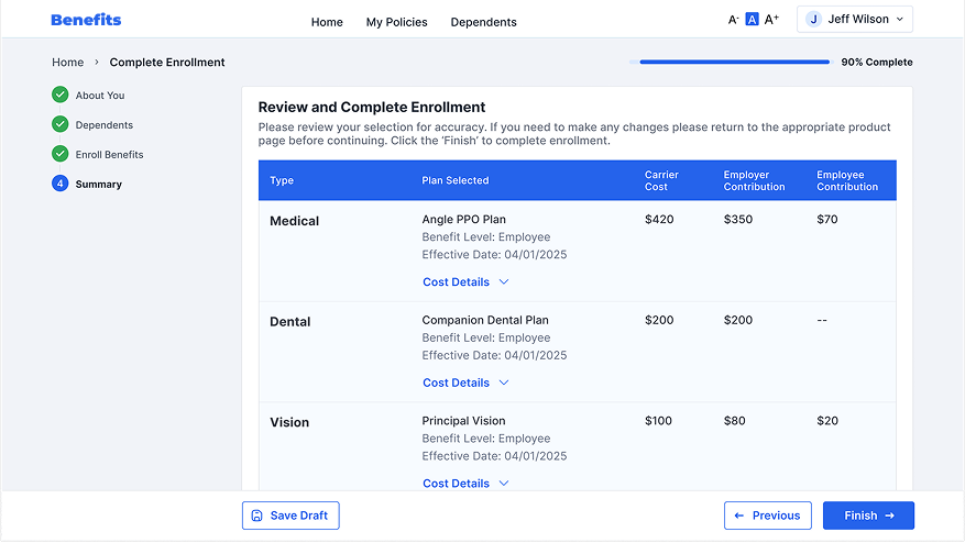
Key screens from the redesigned enrollment experience — from plan selection and comparison to the final confirmation, showing the guided, step-by-step flow that reduces cognitive load and improves decision confidence.

Screen 1: Plan Selection
Screen 2: Plan Comparison
Screen 3: Confirmation
Fig. 05 — Key screens: Plan selection → Comparison → Confirmation flow with guided decision-making
09

Outcomes

35% ↑ Enrollment Completion Rate
30% ↓ Drop-offs During Plan Selection
50% ↓ Average Enrollment Time
45% ↓ Benefits-Related Support Tickets

The redesign transformed a complex, high-friction workflow into a guided, confidence-building experience. By aligning user needs with business and compliance requirements, the solution improved operational efficiency while delivering measurable gains in engagement, completion, and employee satisfaction.
10

What Changed & How We Knew

What changed

  1. Choosing a planFrom a long list of options to guided steps with visible progress, so people always knew what was left.
  2. Understanding costFrom discovering the total at the end to a persistent benefits summary that updates as choices are made.
  3. Reading the fine printFrom dense compliance text to plain-language summaries alongside the required disclosures.
  4. Asking for helpFrom repeated "where do I find this?" questions to answers inside the flow itself.
11

Learnings & Next Steps

What I learned

  1. Guided beats powerfulStep-by-step progress reduced decision load more than any single feature. People wanted to know where they were and what was left.
  2. Compliance and clarity can coexistPlain-language summaries next to the required disclosures kept legal happy and gave employees confidence to choose.
  3. Keep the cost in viewThe persistent benefits summary was the most-used element: nobody wants to discover the total at the end.