[SK] Portfolio / Selected Work / TalentEngine
PROJECT_001 // 2025–26
Talent Platform · Skills & Upskilling

TalentEngine

MY ROLESolo UI/UX Designer
INDUSTRYEnergy · Talent Tech
TIMELINE2025–26
TYPEWeb Application
TalentEngine — Dashboard
My RoleSolo UI/UX Designer
Timeline2025 – 26
PlatformWeb · Talent Tech / SaaS
StatusIn Production
01

The Problem

In energy and industrial projects, skilled professionals move from one engagement to the next — and the gaps between projects are where careers stall. Candidates sat on a bench with no idea why they weren't being shortlisted: job boards showed hundreds of listings, none said how well a role fit, and nothing explained which skills were missing.

Learning lived somewhere else entirely, disconnected from the roles people were chasing. So downtime was spent guessing what to learn, and candidates came back to the market no more hire-worthy than when they left it. Recruiters, meanwhile, couldn't see who was actively improving.

Design challenge: turn a passive job board into a career-readiness platform, one that shows candidates the right jobs, makes their skill gaps visible, and turns time between projects into progress toward the next one.

02

Research Process

As the only designer on the project, I ran a lean, end-to-end research loop:

03

Key Insights

01
Fit Matters More Than Volume

Candidates scrolled past dozens of listings because nothing said which roles truly matched their skills, location and availability.

🎯 Rank by fit, not recency
02
A Rejection Without a Reason Teaches Nothing

When applications went quiet, candidates had no idea whether the problem was a missing skill, a thin profile, or timing. They couldn't act on what they couldn't see.

🔍 Make gaps visible
03
Downtime Is a Learning Window

People were willing to upskill between projects, but only if it was targeted to roles they wanted and rewarded along the way. Generic courses got ignored.

📈 Turn bench time into progress
No fit signal
job lists gave no sense of how well a role matched a candidate's skills
No reason why
silence after applying came with nothing a candidate could act on
No clear path
learning lived somewhere else, disconnected from the roles people wanted
Two products
searching for work and logging hours were in separate tools
04

Solution Design

I designed TalentEngine around one loop: find the right job, see what's missing, close the gap, and get hired.

01
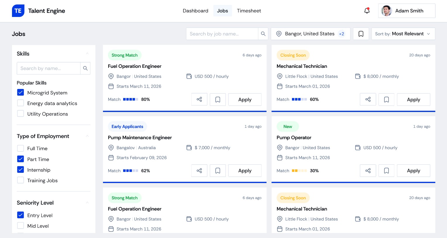
Match-Scored Job Discovery

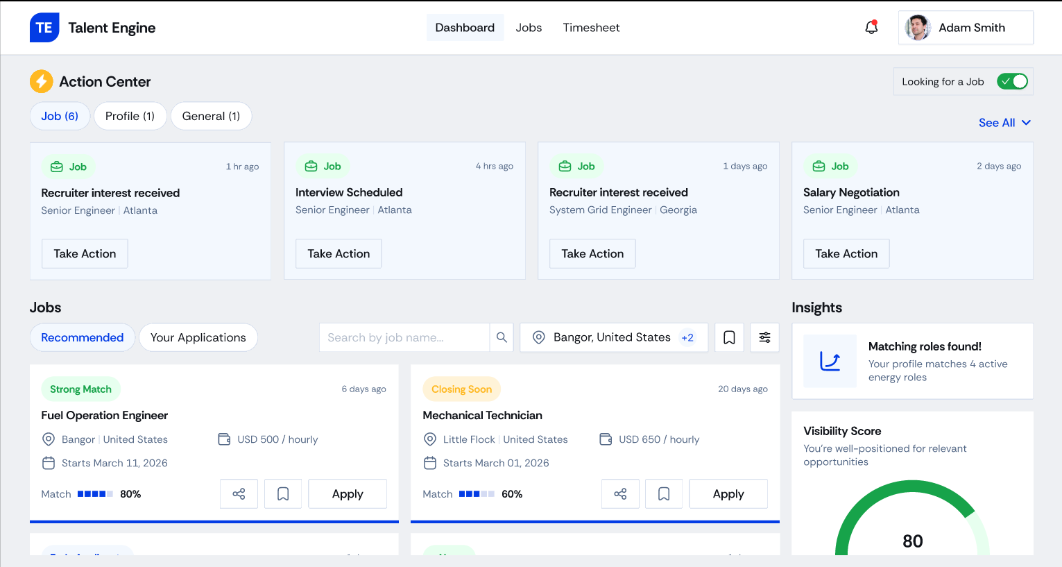
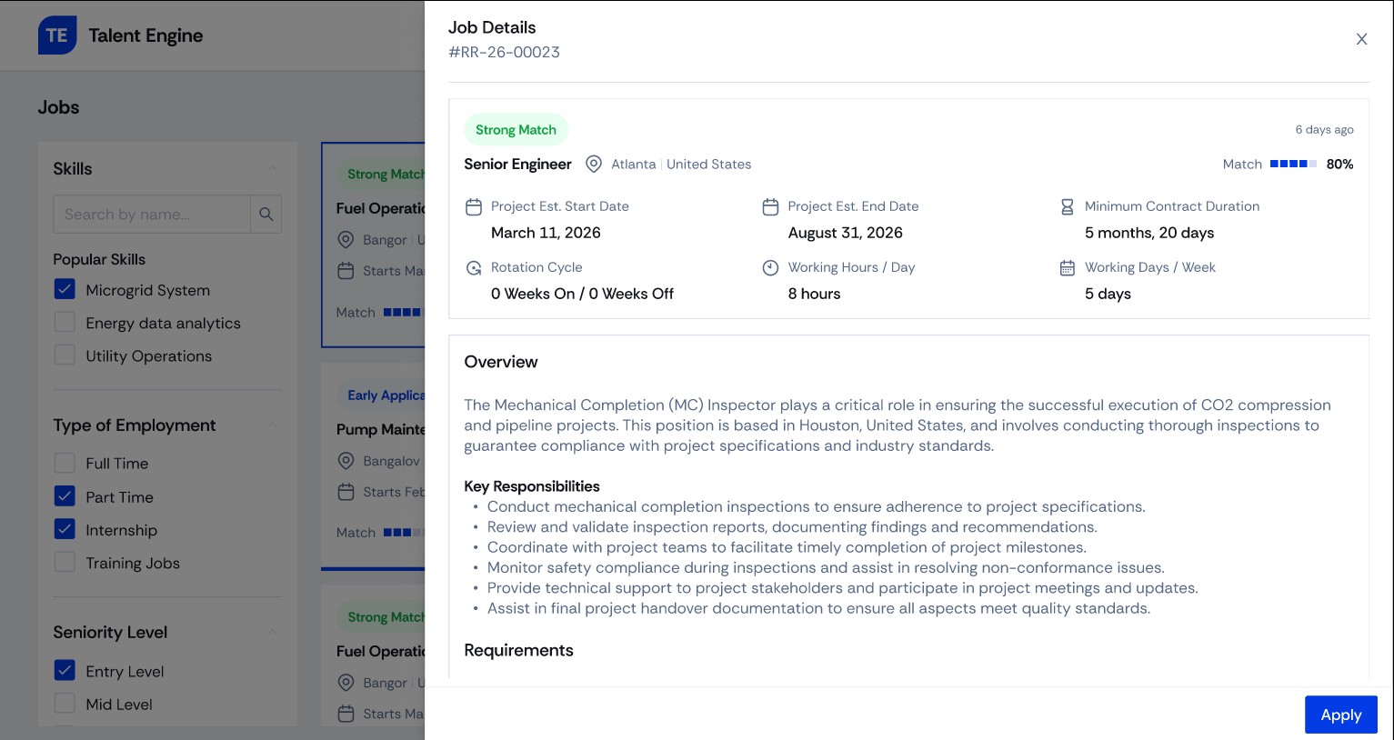
Every listing carries a match score and a status chip — Strong Match, Early Applicant, Closing Soon, New. Faceted filters for skills, employment type and seniority keep results tight, and a detail panel shows dates, rotation and responsibilities before applying.

🎯 Fit at a glance
02
Skill-Gap Analysis

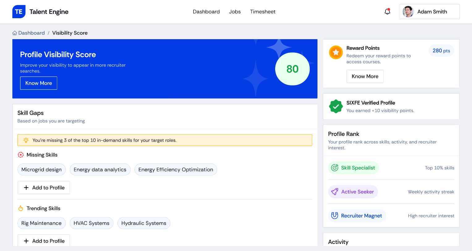
The Visibility Score screen compares the candidate with the roles they target: "You're missing 3 of the top 10 in-demand skills," with the missing and trending skills listed and a one-tap "Add to Profile".

🔍 Know exactly what's missing
03
Upskilling Between Projects

Reward points are earned for profile and learning activity and redeemed for courses, so downtime becomes a path to the next role. Rank badges — Skill Specialist, Active Seeker, Recruiter Magnet — recognise progress.

📈 Learn, earn, level up
04
Action Center & Availability

Recruiter interest, interview invites and salary conversations surface in one prioritised strip with a single "Take Action" button. A "Looking for a Job" toggle signals when the candidate is open to work.

⚡ What needs you, now
05
Guided Profile Builder

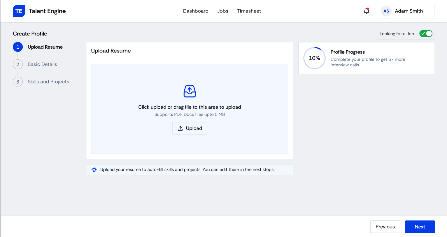
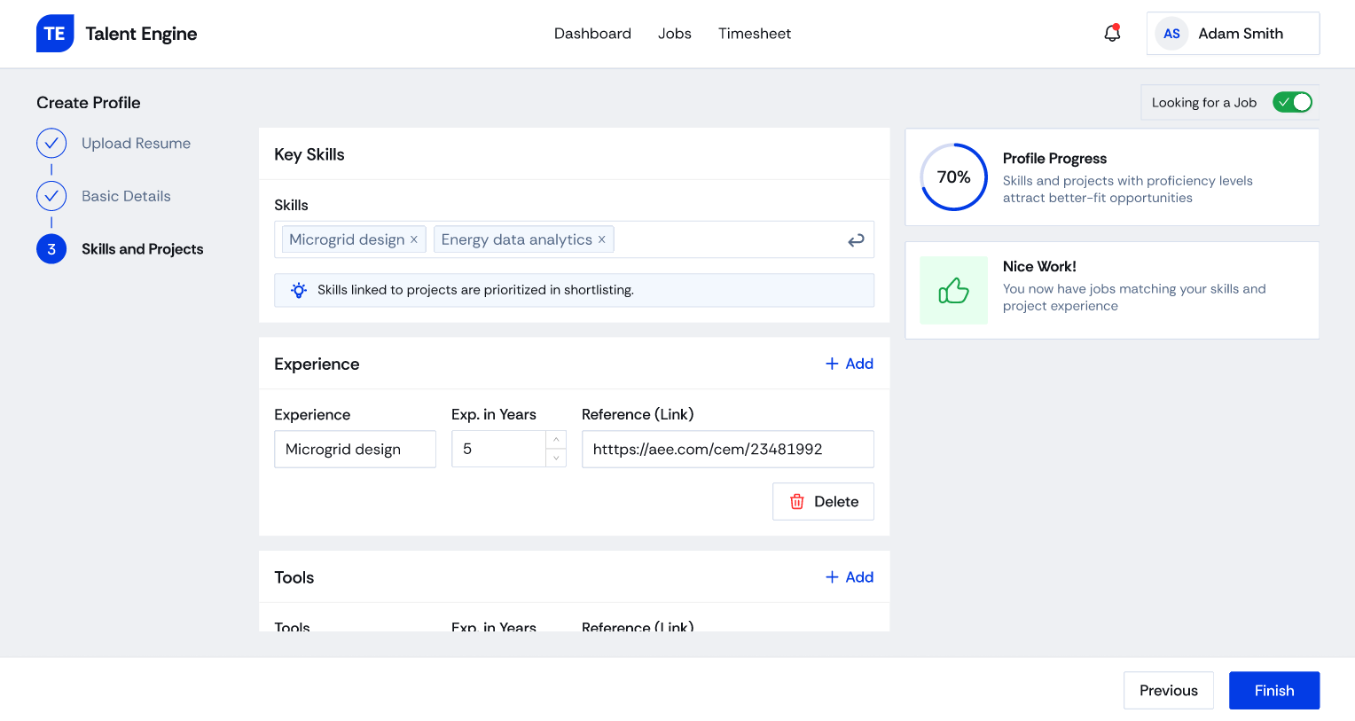
A three-step flow starts with a resume upload to auto-fill skills and projects. Live profile-strength feedback and a verified badge show why a complete profile gets shortlisted more often.

📄 Start from your resume
06
Timesheet When You're Placed

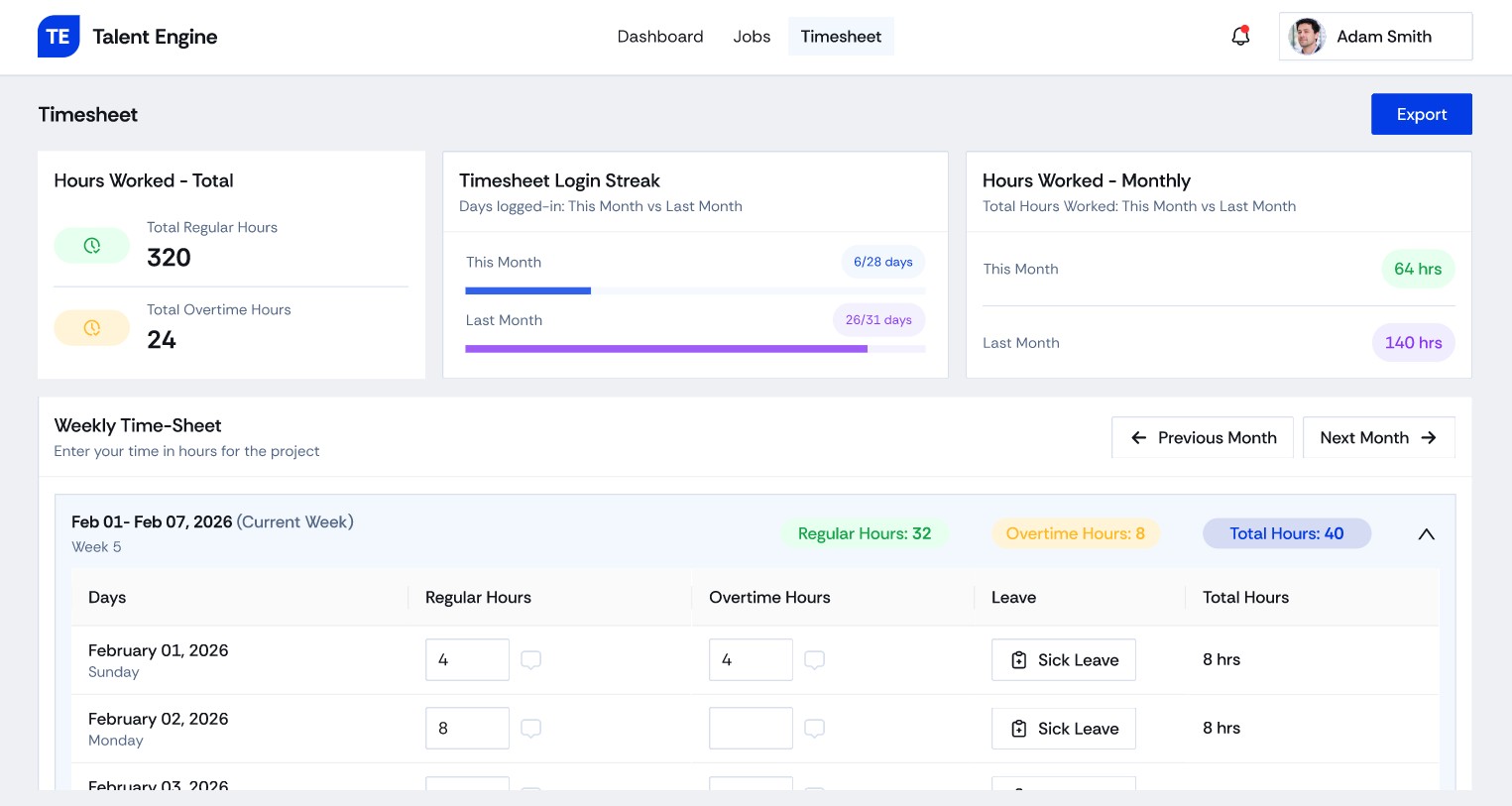
Once on a project, the same workspace handles weekly hours, overtime and leave. Candidates stay in one product from the bench through placement and back again.

🕒 One workspace, end to end
05

Before & After

The legacy product had the right ingredients, but every panel carried the same visual weight. The redesign gives each screen one job and brings fit, status and next steps to the front.
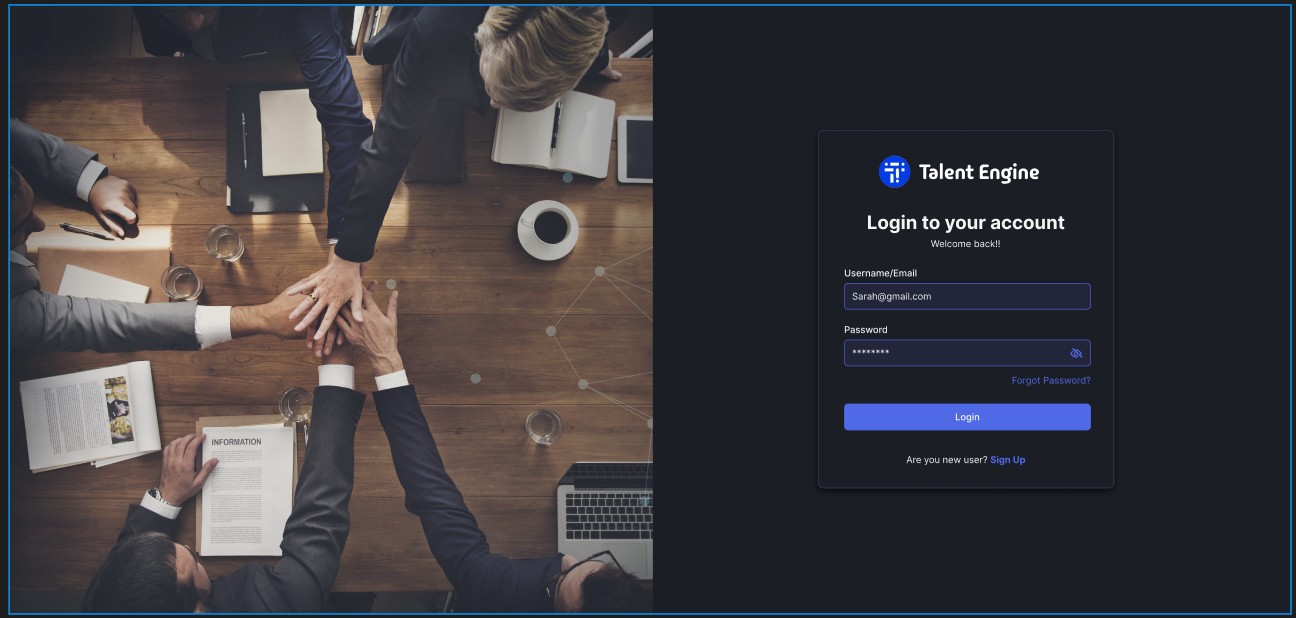
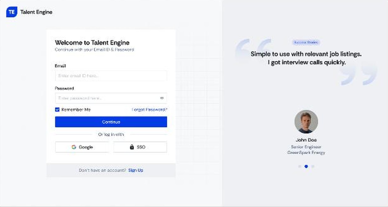
Signing In
Before · Legacy
Legacy sign-in: stock photo beside a dark login card
  • A stock photo takes half the screen and says nothing about the product.
  • One path in: email and password, with no alternatives.
  • A generic welcome gives no reason to trust or return.
After · Redesign
Redesigned sign-in with Google and SSO options and a success story
  • Sign in your way: email, Google or single sign-on.
  • Proof beside the form: a rotating success story from someone in the same field.
  • Light and quiet, so the form is the focus.
Home & Orientation
Before · Legacy
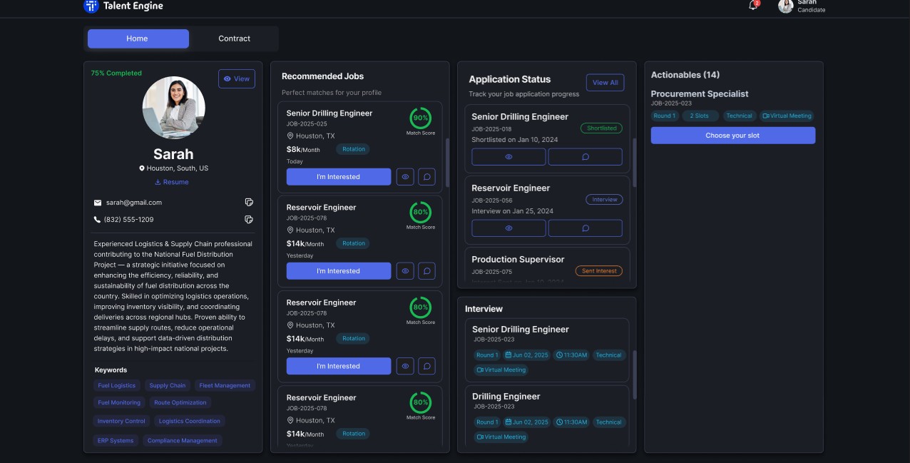
Legacy home: four equal dark panels for profile, jobs, applications and actions
  • Four panels of equal weight: nothing says what to look at first.
  • Scrolling inside scrolling: each list has its own scroll area.
  • Every job repeats the same button, with match rings that carry no explanation.
After · Redesign
Redesigned dashboard with Action Center, recommended jobs and insights
  • An Action Center first: recruiter interest, interviews and negotiations in one strip.
  • Status at a glance: chips such as Strong Match and Closing Soon, with a clear match bar.
  • Insights alongside: a visibility score shows how the profile is performing.
Your Profile
Before · Legacy
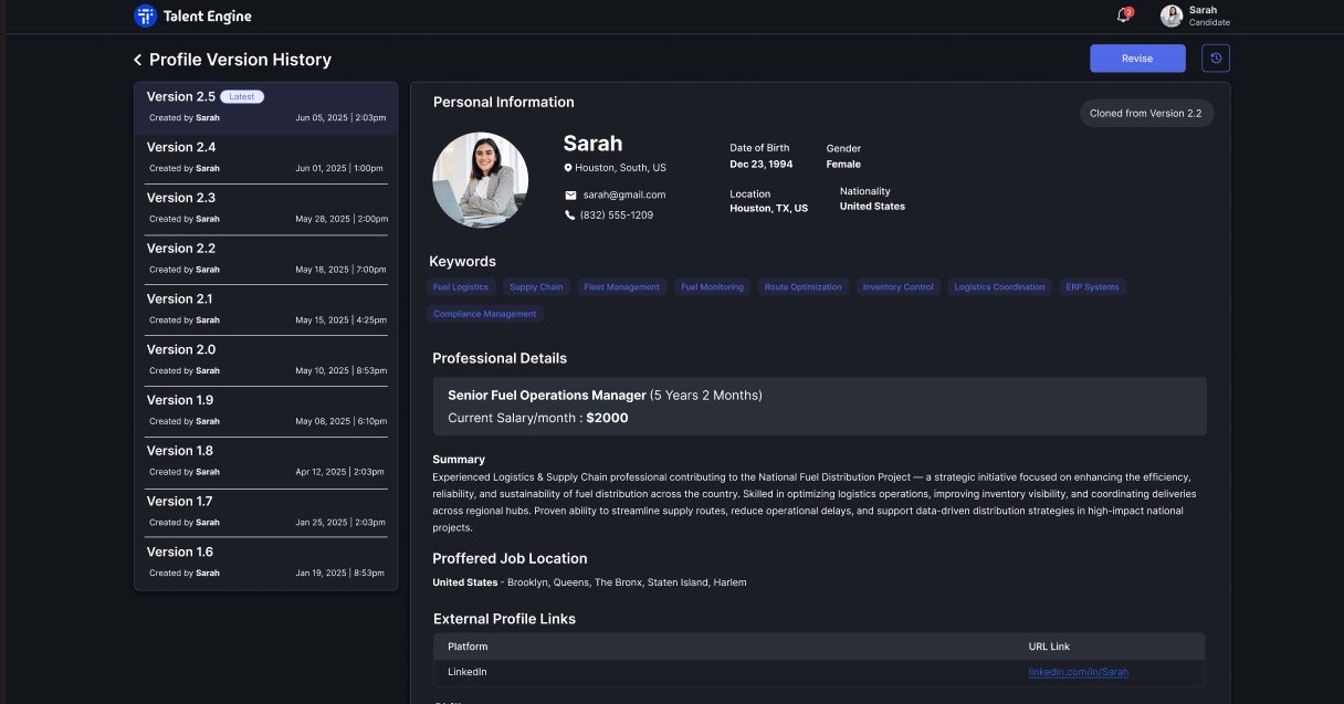
Legacy profile version history listing numbered versions
  • Versions as the main idea: people had to pick from a long list of numbered copies.
  • A long read-only page with no sense of how complete or strong the profile is.
  • Nothing about gaps: no guidance on what to add next.
After · Redesign
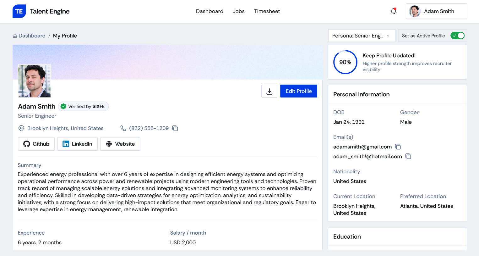
Redesigned profile with verified badge, profile strength and persona selector
  • Personas replace versions: one active profile at a time, switched from a dropdown.
  • Strength made visible: a progress ring and a prompt to keep the profile updated.
  • Trust built in: a verified badge and a one-tap download.
Fig. 01 — Legacy (left) vs redesign (right): sign in, home and profile
06

Key Screens

High-fidelity screens from the TalentEngine Design 2.0 web experience — from job discovery and match scoring, to skill-gap analysis and upskilling, to profile building and weekly timekeeping.

Dashboard: Action Center, recommended jobs and insights
Jobs: faceted search with match scores
Job details panel with project dates, overview and responsibilities
Visibility Score with skill gaps, trending skills, reward points and profile rank
My Profile with verification badge and profile strength
Create Profile, step 1: upload resume
Create Profile, step 3: skills and projects
Timesheet: weekly entry and summaries
Fig. 02 — Key screens: Dashboard · Jobs · Job Details · Visibility & Skill Gaps · My Profile · Create Profile · Timesheet

▶ Explore the interactive Figma prototype ↗

07

Outcomes

Faster Finding and applying to relevant jobs
Clearer Skill gaps made visible and actionable
More Skills added to candidate profiles
Easier Rated more usable than the legacy platform

By showing candidates which jobs fit, which skills are missing, and how to close the gap, TalentEngine turned downtime into progress. In usability testing, candidates found and applied to a relevant role with ease, and most acted on a skill gap in the same session. They described it as the first platform that told them what to do next, not just what was available.
08

What Changed & How We Knew

What changed

  1. Finding a jobFrom scrolling long, unranked lists to a match-scored list with filters and a detail panel, so fit is visible before applying.
  2. Knowing where you standFrom silence after applying to an Action Center and a visibility score that explains itself.
  3. Using time between projectsFrom guessing what to learn to named skill gaps, a one-tap Add to Profile and rewards redeemable for courses.
  4. Staying in one placeFrom a separate timesheet tool to one workspace from the bench through placement.
09

Learnings & Next Steps

What I learned

  1. Show the gap, not just the scoreA match percentage alone didn't change what candidates did. Naming the specific missing skills, with a one-tap way to add them, did.
  2. Downtime needs a reason to engagePoints redeemable for real courses made upskilling feel worth starting, where generic "learn something" prompts were ignored.
  3. Design for the bench and the projectPutting the timesheet in the same workspace kept candidates signing in between assignments, so the platform stayed relevant.